Gig Poster
Built to Spill Houston 03 Multiple Artists (SE) - Regular Edition
About this poster
This year is really going by fast. Hopefully you all are doing as well as you can in this world.
Well, as for me, you've probably noticed that I released the 'CASUALTIES' series that I had been telling you all about. CASUALTIES is actually part of the series of posters for the current BUILT TO SPILL tour. Think of it as sort of a 'project-within-a-project'.
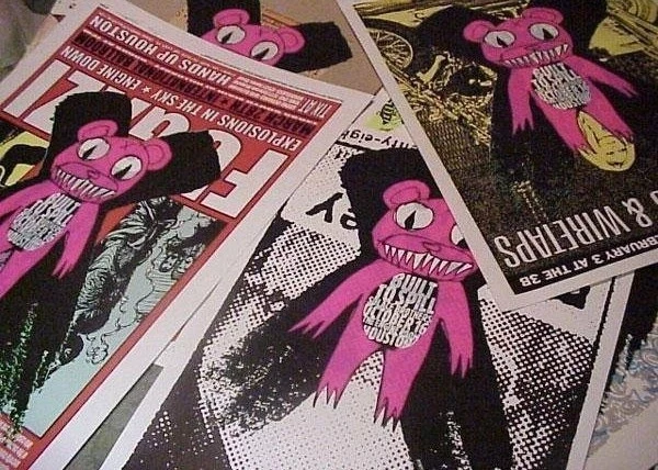
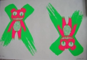
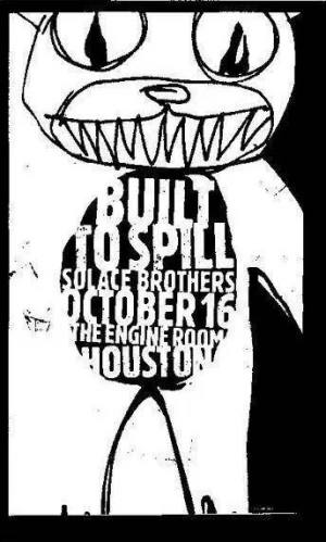
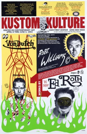
So, what IS CASUALTIES? Well, it's a little collaborative effort between myself and poster/design legend Art Chantry. We decided to make a very special type of poster for the Houston date of the BUILT TO SPILL tour. We created a rough 'design', which basically advertised the show in the most simple terms. We then took this design and printed OVER THE TOP of other concert posters. Actual concert posters which we both had in our collections...some from my catalog, some from Chantry's, and a few from other artists' we admire: all of these posters fell as 'casualties' of our little idea. What resulted was a batch of various defaced/enhanced posters...of various sizes, styles and formats...all containing the same 'new' BUILT TO SPILL image screenprinted over the existing imagery.
It was really quite coincidental that Chantry and I had thought of doing something like this at some point in our careers: obviously he had been thinking about it much longer than I had. I had already planned to do something similar to the 'CASUALTIES' project on my own: the idea being to sacrifice many of the older, more sought after and 'valuable' posters that I had done in my career....Neil Young 99, Radiohead 01, TOOL 98, KMFDM from 95 (the first major band poster Id used my 'teddy bear' character on), etc. I planned to just take a random show, and print it OVER these older, sought after things. Meanwhile, Art had been playing with this idea for years. So, this seemed like the perfect project to have a go...
I am constantly amazed at how certain posters are 'valued'. This is why I knew I would use some of the more valuable things I had done. Remember, in this project...most of the pieces are pieces by Art and I...and are very 'collectible' pieces, some of them. So, realize...we 'X'd' ourselves FIRST and FOREMOST. We are no different from any of the other artists in the concert poster field. I personally wanted to see just HOW people would aesthetically and financially assign value to something that had been drastically altered. If we printed over one of Chantry's early 'Garageshock' posters...or over one of my RADIOHEAD posters from 2001...would it still be worth what it was? Would it now be worth more? Or had our defacing it drastically devalued the poster? Or was it now a totally NEW piece...and therefore, it needed to acquire value all on it's own?
I also wanted to test something out. I've heard from so many folks in the concert poster arena that what we do is NOT 'art'...it's advertising. Some feel that these posters are true 'ephmera'...folks wont even care about them years from now. They are simply ADS. Well, I've always begged to differ...and after this project, I'm more resolute in my stand. Obviously, by some of the reactions from other artists in the field, they're a heck of a lot more than just 'ads'. Some of our colleagues' reactions were as if we had drawn devil horns on the 'Mona Lisa'. My point is that this is EXACTLY the reaction they should have. I don't just 'make ADS'. I try to make thoughtful, breathing ART. The majority of poster artists working today are NOT just pitchmen. They are ARTISTS...and their posters are ART. And the best way to demonstrate this was to sacrifice some of their beautiful work. You may say that I'm full-of-it, here...but yea...this was a 'props' to the artists we used. That's why I wanted to call this 'casualties'. Like soldiers slain in battle for the bigger 'idea'. These posters...mostly MINE and ART's, along with a few others, were 'sacrificed' to make several 'points'. Some of the artists whose work we used were Frank Kozik, Jay Ryan, and EMEK, among others. Sacrifices for the 'idea'. And on an idea like this, you have to go all the way....
As for using the teddy bear...well...believe me, that was not 'accidental'. Of course it was ugly. And pink. It HAD to be. Think about it.
We weren't trying to make a 'beautiful' piece of art. The 'art' is in the idea. Look deeper than the paper.
What's amazing is the response. Now, in the artists community...there's folks who say 'brilliant' and folks who say 'whatever'. We expected that. On the other hand, collectors are NUTS over it. They 'get it'. I've gotten these very eloquent dissertations from poster fans on why they felt this was important and were glad we did it.
I've also heard, 'What has this got to do with Built To Spill?'...as if we somehow didn't hold true to our 'job' of designing a poster with, above all else, BUILT TO SPILL in mind.
Well, put it this way:
- The posters were used to promote this show. The show sold out
- The band LOVED the posters. They spent half an hour trying to choose which ones they wanted for themselves.
- About 80 copies of the poster were brought to the actual show that night, and sold from the merch tables for charity. The fans at the show (the ones whom would easily spot something that has NOTHING to do with the band they've just paid to see) bought every single poster.
- Think about it.
Anyways...just a few of my ideas behind this project since many of you have asked me through emails and phone calls. Its just a poster. Right? Is it?
See, at least...in this little posters case, we're thinking about it.
These posters were created using valuable pre-existing posters with the new BTS imagery printed over them. The sizes range from 16x14 to 36x25 inches. Nobody was able to choose the underlying print.
A total of about 300 of these posters were printed.
- 80 of them were sold at the show...they were signed but not numbered. The money was for a local charity. All 80 posters sold out.
- 10 copies were given to the band.
- 25 copies were hung up around town, in promotion.
- 176 signed and numbered copies are available for sale to collector, the first is numbered zero/176.
- An additional 15 or 20 posters were printed for Jermaine and Art Chantry's personal collection.
There are a few odd ones as well
- 2 or 3 'right-side-up' prints
- several white/no-green prints for X highlights
- the #0/175
- a #00/175 bizarro print
- ...
Edition Details
- Class: Gig Poster
- Release Date: 10/16/2003
- Print Type: Show Edition (SE)
- Designers: Adam Rogers, Art Chantry
- Status: Official
- Technique: Screen Print
- Size: 16 1/2" x 23" (41.91 x 58.42 cm)
- Quantity: 175
- Markings: Artist Signed, Numbered
Gig Details
- Band: Built to Spill (BTS)
- Band: The Solace Brothers
- Date: 10/16/2003
- Venue: Engine Room
- City: Houston
- State: Texas
- Country: United States
Awards
Statistics
- Sold: 0
- 6 Month Average: $0
- Average Price: $0
- Lowest Price: $0
- Highest Price: $0
- Original Price: $0
 Price History
| 08/16/2021 | $350.00 | Private Sale |
| 08/16/2021 | $800.00 | Private Sale |
| 07/29/2021 | $75.00 | Private Sale |
| 07/27/2021 | $50.00 | Private Sale |
| 07/06/2021 | $70.00 | Private Sale |
| 08/16/2021 | $350.00 | Private Sale |
| 08/16/2021 | $800.00 | Private Sale |
| 07/29/2021 | $75.00 | Private Sale |
| 07/27/2021 | $50.00 | Private Sale |
| 07/06/2021 | $70.00 | Private Sale |
| 08/16/2021 | $350.00 | Private Sale |
| 08/16/2021 | $800.00 | Private Sale |
| 07/29/2021 | $75.00 | Private Sale |
| 07/27/2021 | $50.00 | Private Sale |
| 07/06/2021 | $70.00 | Private Sale |
Offers
Recommendations




Comments